You may have noticed that over the last couple months there have been some changes with Suite 4. One of which is our logo. Last month, I had the opportunity and challenge of redesigning Suite 4’s logo. If you saw my post on How to Design an Effective Logo for Your Business, you’d know that this aspect of marketing is my favorite. (You also would have learned a lot of really great info on logo design, so you should check it out!)
Anyway, I was stoked to work on our logo design and create something that really encompasses who we are. With much team collaboration, we established that the only thing we liked about our logo is the teal color. I really didn’t like the font, it doesn’t say modern and personal, it says computer robot to me. And that’s not who we are. I also thought that we really needed to get away from the 4 in the circle. It makes me think of The Fantastic Four and super heroes, which is not original. We also all agreed that the “media, video, search” text at the bottom was arbitrary and useless, so that had to go too. (We decided to change our name earlier on in the planning phase – cutting out the “social,” leaving us with just Suite 4.)
(old logo)
![]()
So we knew what we didn’t want, but what did we want? TEAL. Ok, check! What else? A personable typeface, something that emphasizes our unique name, and something that plays with the 4 or a concept of four. All the while it needed to be simple, memorable, timeless, versatile, and appropriate.
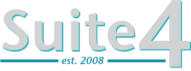
(new logo)

I set out playing with ideas and designs. We played with the plus sign symbol because as an agency we see ourselves as an addition and extension of our clients. However, we decided that the plus sign resembled the medical industry too much so we moved past that. See some of the in-progress designs below.
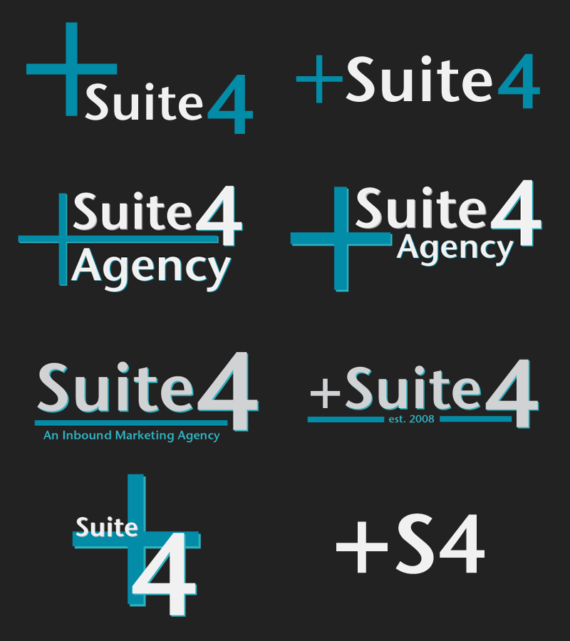
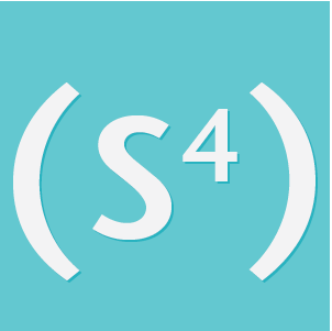
Finally, we settled on two versions of our logo. One is a logotype – our full name. It’s a great horizontal design that fits all of the requirements we set out for ourselves, except it doesn’t work as well as a square and we wanted something more symbolic. So, the other design was invented to be more of a symbol or graphic. This one is square and simple which works great for our social media presence. The (S4) design is a symbolic version of our name that stemmed from the plus sign idea which extended into more mathematical ideas and finally resulted in what we have now. I created different versions of the logo, one with a background color and one without. This helps with the versatility factor. Having more than one version of the same logo gives you options for how to present your logo depending on the context for its use.

Anyway, that’s all for now folks! We hope you like our new logo as much as we do!
If you’re not sure how to incorporate strong branding for your business, see how some of our clients have succeeded with implementing it on their website or in a newsletter.